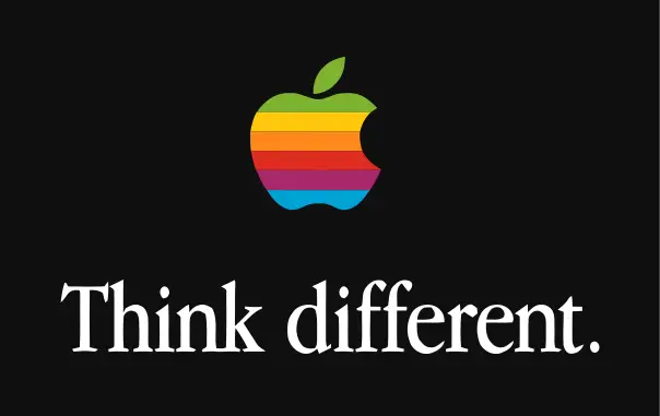
Who has not heard of The Apple company?
It is one of the most popular American multinational technology company that has its headquarters in Cupertino, California. It not only designs and develops consumer electronics and software, but also provides its customers with online services.

Out of all the logos of different technology companies in the market, The Apple’s logo has always received a lot of appreciation from the market. Now here’s a secret that you probably didn’t know:
The Apple’s Bite:
The bite of the apple is taken to help it look like an apple and not like an ordinary cherry. Since the company wanted to ensure that the people don’t misunderstand the logo to be a cherry, the team decided to take a bite out of it.
Has The Apple’s Logo Got Anything to do with the Story Of the Adam’s Apple?
To be honest, neither the name of the company nor the logo has got anything to do with any of the stories related to Adam and Eve.
Rob Janoff, designer of the Apple logo explains to creativebits
I designed it with a bite for scale, so people get that it was an apple not a cherry. Also it was kind of iconic about taking a bite out of an apple. Something that everyone can experience. It goes across cultures. If anybody ever had an apple he has probably bitten into it and that’s what you get. It was after I designed it that my creative director told me: “Well you know, there is a computer term called byte”. And I was like: “You’re kidding!” So, it was like perfect, but it was coincidental that it was also a computer term. At the time I had to be told everything about basic computer terms.
H/t : creativebits


